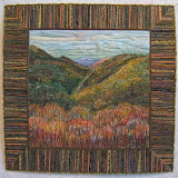
Prairie Flowers
Instead of lake pieces here are two of prairie flowers constructed in the same "ortwork" technique.
 Summer Prairie Flowers - 13"x 11"
 Spring Prairie Flowers - 13"x 11"
More is to come about this prairie flower project.

Instead of lake pieces here are two of prairie flowers constructed in the same "ortwork" technique.
Summer Prairie Flowers - 13"x 11"Spring Prairie Flowers - 13"x 11"Wishing you a happy day from my "turkey" with his singing Elvis lobster. He's already visited Graceland to shop for more stuff(ing) for the Elvis Shrine Room.
 I am thankful to have this Elvis fan and his quirky sense of humor in my life.
The values we use in our art is the language of emotions that triggers reactions. We each naturally respond to various combinations whether we're viewing OR choosing them for our work. Most of us create with what "feels right". That is the heart of individuality. Just as our verbal language is full of nuances depending upon the tone of our voice and words we choose, such is the combinations of values, hues, and patterns that we put together in our art.
Kay had left this comment/question on my post, "Value vs Color".
"This is a fascinating post. I've never heard the ideas about the mood created by different values before. I also have a light value quilt on my bedroom wall (with less contrast than yours) and I agree about the mood effect. I find it peaceful early in the morning. The only one of these I question is the last contrast, medium value (low contrast). Surreal and mystery fits your piece, but aren't the fabrics partly responsible for that? Would all colors create the same effect, do you think? "She has a good point. I realize this particular piece for that study is on the edge of acceptance for the given description. My choice of fabric patterns does play a role in the surreal mood of the piece. It was the last one I had done of the six pieces because working in a limited middle value range of colors is not easy ... and by then I was DONE. Now that I've shared this theory and those pieces, I guess I'd better address that category more thoroughly.


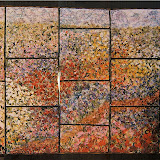
 "Land of the Unicorn" - 12"x12"
 "Coming Unstrung" - 28"x24"

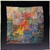
 "Inner Spectrum" (51"x 51")
 This piece is made from plain and commercially printed fabrics that I hand painted. There is both hand and machine quilting. I whip stitched a silk thread around the quilting stitches within the window frames to accentuate those lines.
 Exhibitions:
 Quite a few years ago I came across information in the book, "Color and Fiber" that translates to:
"The first visual response is to value contrasts rather than to colors."

 medium values dominating = strong, direct, rich, open
 dark values dominating = mysterious, dramatic, dignified, somber
 light values = delicate, atmospheric, serene
 medium values = surreal, mystery, fantasy
 dark values = somber, depressed, brooding
RED
China: Good luck, celebration, summoning
Cherokees: Success, triumph India: Purity
South Africa: Mourning Eastern: Worn by brides
Western: excitement, danger, love, passion, and stop
ORANGE
Ireland: Religious (Protestants)
Western: Halloween, creativity, autumn
YELLOW
China: Nourishing Egypt: Mourning
Japan: Courage India: Merchants
Western: Hope, hazards, coward
GREEN
China: exorcism
India: Islam
Ireland: Symbol of country
Western: Spring, St. Patrick's Day, go
BLUE
Cherokees: Defeat, trouble
Iran: Heaven, spirituality
Western: Depression, coldness, royalty, wisdom
China: Immortality
Middle East: Protection
PURPLE
Thailand: Mourning
Western: Royalty, luxury, sensuality, magic
WHITETo read more about the symbolism and psychology of color go here.
Eastern: Funerals India: Unhappiness
Western: Brides, angels, peace
BLACK
China: Color for young boys
Thailand: unhappiness, evil
Western: Death, mystery,


 Fabric Bird Sculpture Pattern