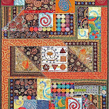
Interpret This-2010
The Interpret This! Challenge was a yearlong challenge during 2010 among 9 quilters. The goal was to interpret a photo each month with
fabric and thread. The interpretation was solely the decision of the
quilter and the monthly progress was kept a secret until the end of the
month when each piece was revealed.
The monthly challenges were:
January: Self-portrait introduction of each artist
February: Shanghai Food photo submitted by Rian Ammerman
March: French Dolls photo submitted by Kay Scheidt
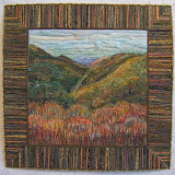
April: Snake River photo submitted by Nellie Durand
May: Heather Farms Park photo submitted by Libby Fife
June: Butterfly Garden photo submitted by Karen
August: Annecy France Castle photo submitted by Beverly Hart
September: Indonesian Gate photo submitted by Debra Spincic
October: Saratoga Springs Fountain photo submitted by Jdemillo
November: Sissinghurst Castle Garden submitted by Kim Campbell
December: Along the River photo submitted by Barbara Lardon
The artists were:
- Rian Ammerman
- Kay Scheidt
- Nellie Durand
- Libby Fife -- Co-hostess
- Beverly Hart
- Debra Spincic --Co-hostess
- Jdemilo
- Kim Campbell
- Barbara Lardon
JANUARY CHALLENGE
Color ......
 I'm All About Color (13"x 17")
Cotton Fabric, tulle, silk flowers and yarns
oil stick pastels and paint
computer manipulated print
machine quilted
Color ...... Color is a prime element in my work ...... there is no Color that I don't like ...... my world is full of Color!
Periodically
through the years, I've attempted to do a self-portrait. Each time I
ended up scrapping it. Need I say this challenge made me nervous about
finally succeeding? It began with a picture taken by the camera built
into my computer.
 This
point of view seemed appropriate since my husband claims I spend so
much time on the computer. He often sees me peering up over my glasses
and the screen to acknowledge his presence ... or interruption.
This
point of view seemed appropriate since my husband claims I spend so
much time on the computer. He often sees me peering up over my glasses
and the screen to acknowledge his presence ... or interruption.
I
started out to make a pattern and had planned to use fabrics to portray
what I see in that photo. However, this had not worked for me in the
past. Now that I am more computer literate, I decided to play with the
picture in "Adobe Photoshop Elements".
 The first photo in the above strip is the original picture. The next one shows it "posterized". Then I gave it "poster edges".
I
played with all the filters in the "Elements" gallery. I liked the
effect that happened to my hair in the photo on the left side in the
frame below. For the life of me, I can't remember, nor figure out what I
did to get that particular effect.
 I
printed both of them onto paper with my Canon printer. After cutting
and playing a bit I was sure that I needed both of them printed on
fabric. This was the first time I've used commercially prepared for the
printer fabric. The picture of me on the left was transferred to one
that was fusible (on the left below) while the picture on the right side
was transferred to the fabric stiffened with paper (on the right
below).
I
printed both of them onto paper with my Canon printer. After cutting
and playing a bit I was sure that I needed both of them printed on
fabric. This was the first time I've used commercially prepared for the
printer fabric. The picture of me on the left was transferred to one
that was fusible (on the left below) while the picture on the right side
was transferred to the fabric stiffened with paper (on the right
below). The
unfused fabric portrait part of my face and hair was cut away from the
background. Just portions of my highlighted hair were cut from the print
with the fusible. Fusing those pieces of hair to the other printed hair
took the highest heat setting on my iron and a longer time than I've
ever used for the fusing process.
The
unfused fabric portrait part of my face and hair was cut away from the
background. Just portions of my highlighted hair were cut from the print
with the fusible. Fusing those pieces of hair to the other printed hair
took the highest heat setting on my iron and a longer time than I've
ever used for the fusing process.
I traced the outline
of my glasses from one of the paper photos onto the paper of a fusible
web over a lightbox. That was then ironed onto a polka dotted fabric.
The dots were colored with permanent markers.
 Then
the glasses were cut out and fused over the pair on my fabric printed
portrait. I also softened some of the "posterized" edges and added more
highlights to my hair with oil stick pastels. Then played with various
backgrounds.
Then
the glasses were cut out and fused over the pair on my fabric printed
portrait. I also softened some of the "posterized" edges and added more
highlights to my hair with oil stick pastels. Then played with various
backgrounds. The
fabric in the above photo is one of those extra special pieces in my
stash. I love the marks and designs on it. However they were not made by
me so I didn't use it. The one that I had airbrushed loops and
squiggles on won out. My signature "ortwork" technique of scattering
bits and pieces from previous projects had to be a part of this piece.
The
fabric in the above photo is one of those extra special pieces in my
stash. I love the marks and designs on it. However they were not made by
me so I didn't use it. The one that I had airbrushed loops and
squiggles on won out. My signature "ortwork" technique of scattering
bits and pieces from previous projects had to be a part of this piece. Before
the collage process, I sculpted my face with layers of batting. There
are more layers over my hair and down the center of my face, while there
is none on my eyes.
Before
the collage process, I sculpted my face with layers of batting. There
are more layers over my hair and down the center of my face, while there
is none on my eyes. The
piece of netting is there to hold the layers of batting so they would
stay in place while when I positioned it on the background. The excess
around the edges was trimmed away.
The
piece of netting is there to hold the layers of batting so they would
stay in place while when I positioned it on the background. The excess
around the edges was trimmed away.
Another layer of
tulle netting on top holds all the bits and pieces as well as my padded
portrait together. Selecting a soft violet colored tulle softened the
strong and harsh colors as well as the hard edges. This subdued element
more accurately portrays my personality and outlook on life ... both are
definite, but not harshly expressed.
 I
free-motion quilted around my silhouette as well as around the eyes,
down one side of the nose, the smile line between the lips and along the
bottom edge of the glasses with a dark monofilament thread. A loop
pattern in the background with a variegated thread was done too. Then
flowers were added to the surface by free-motion quilting their centers.
Finally, defined squiggles and loops were added by couching yarn to the
surface. A heavier black yarn that had dots of color in it was couched
in place to become the holders of my glasses. Also, a lot more blending
and highlighting with the oil stick pastels as well as some ink work on
my face was done.
I
free-motion quilted around my silhouette as well as around the eyes,
down one side of the nose, the smile line between the lips and along the
bottom edge of the glasses with a dark monofilament thread. A loop
pattern in the background with a variegated thread was done too. Then
flowers were added to the surface by free-motion quilting their centers.
Finally, defined squiggles and loops were added by couching yarn to the
surface. A heavier black yarn that had dots of color in it was couched
in place to become the holders of my glasses. Also, a lot more blending
and highlighting with the oil stick pastels as well as some ink work on
my face was done.
Finally, here are the original photos next to my finished portrait.
 I'm
pleased the final piece doesn't mirror its origin. They all look like
me, but there is so much more in the piece of art ... it projects how I
feel on the inside rather than what I actually look like on the outside
... a view of me from the inside out.
I'm
pleased the final piece doesn't mirror its origin. They all look like
me, but there is so much more in the piece of art ... it projects how I
feel on the inside rather than what I actually look like on the outside
... a view of me from the inside out.IT Member Portraits

........................................................................
February Challenge
Rian's Photo
 A plate of food in a Shanghai Restaurant


"The Clean Plate Club" (17"x 13")
Cotton and Silk fabrics
Wood, paint, and yarn embellishments
Hand appliqued and painted
Machine pieced and quilted
Wood, paint, and yarn embellishments
Hand appliqued and painted
Machine pieced and quilted
I
grew up in the era of adults admonishing children to "Clean your
plate. There are starving children in China." Consequently, no morsels
get left on my plate ... and that's what I brought to my interpretation
of Rian's chosen photo of a sumptuously filled plate. Also, I've dined
in some elegant Chinese restaurants here in the states and in Hong Kong
so I've experienced their ornate and gilded decor ... another element I
chose to feature from the photograph.

The
first thing I did was convert the photo to black and white to determine
the balance of values. A strong contrast of light and dark dominates
with a lesser amount of middle values. My piece has the same balance
but with a different distribution ... the middle values ended up
concentrated in the red panel on the side.


The plate is made from a silk crepe. I stabilized that soft, draping fabric by ironing two layers of Sulky Totally Stable cut in circles the size of the plate. This is a paper product and intended to give fabric stability for machine embroidery.

Now, I wish a heavy-weight fusible fabric had been used instead of paper. There are wrinkles in the plates edge because Sulky's paper stabilizer came loose and wouldn't "refuse" again.
 I
wanted the outside edge of the plate to be raised. Just a circle of
batting almost did this. I ended up inserting another circle cut from
light-weight cardboard to stabilize that edge.
I
wanted the outside edge of the plate to be raised. Just a circle of
batting almost did this. I ended up inserting another circle cut from
light-weight cardboard to stabilize that edge.In the meantime, the silk was clipped and glue basted to the underside of the plate.
 The
coloring on the plate to indicate the presence of food was done by
smudging oil stick pastels onto a cloth and then rubbing the pigment on
the plate. I also used white acrylic paint with shimmer and then coated
it with acrylic medium to leave the sheen of a dirty plate.
The
coloring on the plate to indicate the presence of food was done by
smudging oil stick pastels onto a cloth and then rubbing the pigment on
the plate. I also used white acrylic paint with shimmer and then coated
it with acrylic medium to leave the sheen of a dirty plate.Initially, free-form cut pieces of cotton were fused to the plate. I thought those would give the effect of tracks made by the chop sticks having scraped through the food. That's not what happened so they got buried under layers of pigment and paint.


A mixture of metallic gold pigment powder and fabric medium is painted inside the quilted spiral patterns that decorate the table. I love the precise effect of quilting, then painting for this piece. There was good coverage with just one coat and the fabric is soft, not stiff, where it's painted.
The wooden chop sticks are sewn on
with clear mono-filament thread. A strip of red-orange chenille yarn is
couched over the seam of the side panel. That fabric, by the way, was
an accidental discovery. It's part of an old outdoor cushion cover made
from fabric I had bought in Hawaii a looooong time ago. I had dug it
out to use as the backing for this piece. It just happened to be laying
in the right place for me to see that the widest stripe would be
perfect for the front. The outside edge of this piece is finished with a
heavy brown chenille yarn couched by machine.
I've
used the same dimensions (17"x 13") for this second challenge as I did
for for the first one, my self-portrait. I intend to use this
measurement for all the rest as well. The orientation of the rectangle
will vary according to the subject.
IT Member Submissions

IT Member Submissions
......................................................................
MARCH CHALLENGE
Kay's Photo
 A doll factory in France
 "Waiting" (17"x 13")


APRIL CHALLENGE
Kay's Photo


cotton, lace, wool roving, thread ravels, tulle
oil stick pastels & colored pencils
machine quilting
Dolls. I love dolls. I've
collected dolls. I've restored dolls. I've made dolls. I've dressed
dolls. This photo of dolls delighted me. Consequently, I didn't stray
far from the original for my interpretation.
To
begin I printed out two copies of Kay's photo in various sizes. Each
of the paper dolls were cut out. I found fabrics in my stash that
represented the table, box and crate, and background drape. Those
fabrics were cut and arranged to portray the structures within the
photo. Wool roving was pulled apart and used to shade the cotton
fabrics. Then I began to play with the paper dolls.
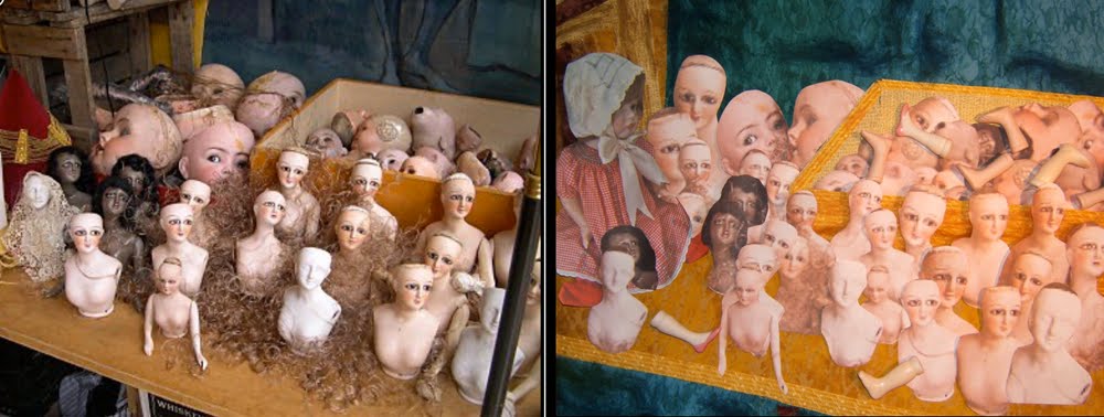
The
red cone at the left edge of the photo puzzled me. I have no idea what
that is. However, it reminded me of the doll wearing a red silk
gingham dress sitting on my dresser. I took her photo, then printed and
cut it out. She filled that space nicely, repeating the shape and
color of the unknown object. She also made this piece personal to me.
There
was another personalization that had excited me early on. Initially I
thought this was the perfect opportunity to finally use all the doll
legs that were saved from the many Christmas tree top angels I had made
over the years as gifts ... they all had smocked gowns and hand-made
battenburg lace wings, and a cardboard tube from the waist down. Those
added doll parts to the layout on my table looked good in digital photos
that were taken to record the placement of all the paper cutouts and
porcelain legs. However, when they were attached to the actual surface
after the piece was quilted, those dimensional legs were distracting.
Actually, they stood out like sore thumbs.
There
is one doll in the photo that is draped with lace. I have drawers of
lace ... both old and new. However, I couldn't find a white piece that
was the proper scale, but there was a wonderful very old black lace that
was.

Studying
the paper cutout composition, I determined there needed to be a focal
point in the lower right corner to balance the large doll heads, my
doll, and the black doll heads. I took my clue for her placement from
the black metal rod that cuts across the corner in the photo.
The
construction of this piece is a collage technique. All the elements,
both background and foreground are cutouts, roving, and thread ravels
that are arranged and then held in place with a surface layer of tulle
netting. Machine quilting holds all the layers together. Within the
dolls faces there is very little quilting. Most have just the line
under the eyes quilted. This softened their gaze by directing it
slightly downward.

After
the fact I found out that I could have requested an image with a higher
resolution than the 40 KB of this one to reproduce. As it is, my
solution worked better for my purpose ... there's more of me in the
fix which adds my hand to those dolls painted faces. The images I
printed on fabric were pixelated. I fixed that by "drawing" over
lines with watercolor pencils and markers, then shaded and highlighted
with oil stick pastels. Of course, the outside edges were smoothed by
the process of cutting the image out of the whole picture. Then too,
quilting lines have something to contribute, as well.
As for the title, I have the sense that all these doll parts are "waiting" for the doll maker(s) to come back and make them into completed dolls ... like the one sitting on the end of the table.
IT Member Submissions

As for the title, I have the sense that all these doll parts are "waiting" for the doll maker(s) to come back and make them into completed dolls ... like the one sitting on the end of the table.
IT Member Submissions
................................................................
APRIL CHALLENGE
Nellie's Photo

A crumbling bank along the Snake River in Jackson Hole, Wyoming.

Strata (side 1) 13"x 17"
glazed cotton decorator fabric samples & tulle
mono filament thread & yarn
raw-edged collage
machine quilted

Strata (side 2) 13"x 17"
cotton fabrics, cheese cloth, tulle, yarn
variegated quilting threads
"ortwork" collage
machine quilted
I have loved this photo that I took of a crumbling bank while rafting the Snake River in Jackson Hole, Wyoming in 2006. The exposed strata of rocks, soil and roots above the clear running water intrigued me. And of course, I knew just how I wanted to interpret it. But wait ... what I had in mind is what a lot of people would expect me to do. I like a challenge, plus participation in this group is pushing me to stretch beyond my comfort zone.
Strata - 13"x 17"

It began with a quick sketch of proportions for the elements in the photo so I could scale them up to a larger size.
Years
ago I had set aside this set of decorator fabric samples for some
project in the future. All those smooth round stones in the photo made
me think of the circular patterns in that fabric.

I
wondered what the whole picture would be like if it was made only from
circles. It is the only fabric I used and was fussy cut to get the
coloration needed for the different elements. Now I have a bunch of
scraps that look like Swiss cheese. The process of getting it together
is the same as I had done for last month's doll piece. The raw edged
pieces are arranged on the batting, then a layer of tulle netting is
laid on top. Quilting holds the layers together.
Scraps. I really am hooked on working with scraps. All the while I was composing this, I really, really, really
wanted to interpret that picture with my "ortwork" collage technique
... in the way most everyone expected. Sooooooo....I flipped the piece
over and collaged the backside from this bag of scraps.

Viola! A two sided quilt.....

Because
I had not intended to do this, there were complications caused by the
lack of planning. My first thought was to quilt the more realistic
terrain lines with a dark thread in the bobbin so they would show up on
the circle fabric side. However, I had not reversed the image for the
back side, so that idea was out. I ended up moving the front side
composition with the circle fabrics to another piece of batting. Then I
quilted each piece separately ... the natural lines of the terrain and
elements on the "ortwork" back side and around the circles on the
"front" side.
The
two were connected together in the process of couching the yarns that
finish the outside edge. I left about an inch unstitched on each side
so there is an opening for a stick to pass between the front and back
pictures. The ends of the stick extend beyond the sides of the quilt
for hanging on two nails. There are a few lines of quilting through
both layers that meander through the center of the quilt to keep them
together, as well.
I
like both versions and am glad I explored a different path for
interpreting what I see in this photo. However, I'm partial to the
"ortwork" one. I feel awe at the transformation of those bits and
pieces that would normally be discarded. Beverly
had mailed a baggie of raveled threads that she trimmed from her dyed
fabrics. The shrubs are the pulled apart tangles of the greens. Masses
of roots are represented by pulled and twisted gold cheese cloth she
included. Thank you, Beverly. Pieces cut away from the photo
transferred fabric for last month's challenge play in there, too. Also,
each side is finished with different colors of tulle ... light blue on
the circle side and yellow/orange on the "ortwork" side.
Strata II - 13"x 17"
I've
always liked making interesting backings for my quilts. Creating a
focal piece for a back is a first for me. Now, which way should I hang
it for viewing?
IT Member Submissions:

IT Member Submissions:
.................................................................
MAY CHALLENGE
Libby's Photo

A park in southern California

Spring Bouquet (13"x 17")
silk flower petals and leaves
antique lace, yarn, batik fabric,
silk organza, tulle,
soft plastic cover from a sample book
oil stick pastels
My interpretation of Libby's photo is limited to the end of one branch.

Those blossoms were "virtually picked and arranged" in one of my favorite vases ... a water globe.

I
had arranged stems of azalea blossoms in the globe for reference. For
those who are not familiar with this type of vase, the stems of the
flowers are inserted into holes of a black rubber base. The globe is
filled with water, then the arranged flowers are lowered into the water
and rubber base is sealed around the glass opening. There's always an
air bubble that gets trapped when the vase is turned upright. I
included the heavy cotton ecru lace with the intention of making oil
stick rubbings on fabric to duplicate the look of the shadows in
Libby's photo.
I
couldn't believe the luck of already having the perfect piece of
green batik with the look of shadows in my stash of fabrics.

A piece of black cotton sateen was backed with a fusible and cut out for the rubber base, then fused into place.
I
drew and cut a template for the globe on freezer paper, then ironed
the waxy side onto a piece of white silk organza. After it was
positioned, I stitched around the outside edge of the paper template,
then trimmed the excess organza outside the line of stitches.

Now
it was time to replicate that air bubble with another piece of
organza. This was a scrap leftover from someones curtain making.
Again, a freezer paper template was ironed onto the organza. It was
pinned into position and I machine stitched around the outside of the
template and then trimmed away the excess.

Next was the fun of sorting through all my dismembered silk flowers to find the appropriate petals for the cherry blossoms.

They
were reshaped and glued into clusters. The blossoms were built up by
adding one petal at a time. After a drop of glue was added a pin was
inserted to hold the petal in position.

A
couple of evenings were spent making flowers while I watched "Dancing
With the Stars" and "American Idol". The completed blossoms were
arranged "in" the globe. I included silk leaves that were shaded with
oil stick pastels.


It looked awful. I think the problem was the scale of the cherry blossoms is smaller than those in "Hollyhocks".
I removed those stitches. Then while considering what to do about
quilting the blossoms, I machine quilted veins and around the leaves. I
liked the look of the petals not being quilted. However, something had
to hold them to the surface besides the fragile tulle netting. There
was a piece of thick clear soft plastic I had saved from the cover of a
fabric sample book lying on the table. In desperation I placed it over
the flowers on my quilt. That is exactly what was needed.

A
bit of fabric glue holds each blossom in place. I used a Teflon coated
foot for my machine to stitch the plastic to the fabric background (a
sheet of tissue paper placed on top would keep a regular machine foot
from sticking to plastic). I also lengthened the stitch so I could trim
close to the seam and the stitching would hold the perforated plastic
in place. A piece of fine shiny iridescent yarn was couched next to
the edge for a neat finish.
I
could hardly believe how the fabric flowers appeared so much like those
immersed in the real globe vase. They appear to be magnified by
water. Plus, the surface of the plastic reflects light just like the
glass vase.

The
shadows cast by the cherry trees immediately brought lace patterns to
mind. This is the same antique lace that drapes one of the doll figures
in my March interpretation, "Waiting". It serves to form a foundation on which the vase is displayed.
Patterns
in the batik background are shaded with oil stick pastels to suggest
the shapes of the trees in the background of the photo. The edge is
finished with couched yarns. I like the result of my novel solution for
the globe, but doubt that plastic sheets will become a commonly used
material for future projects.
IT Member Submissions:

...................................................................................
IT Member Submissions:
...................................................................................
JUNE CHALLENGE
Karen's Photo

Forest Preserve in Chicago area

On The Forest Floor - 17" x 13"
cotton, synthetic & silk fabric scraps, tulle,
"silk" leaves,
printed image on fabric,
oil stick pastels, paint, permanent marker
machine quilted
Where
this beautiful blue butterfly was photographed by Karen was the first
and strongest thought in my mind, for I have walked in the Forest
Preserves that thread through the suburb's of Chicago. That initial
thought wouldn't leave my head so I took on the challenge of portraying
the forest floor. The "groundwork" began with the green scraps I set
aside while digging through my bags for pieces to make waves on my BIG
lake quilt.

I
happened to have a bunch of silk grape leaves in my stash. They were
cut into long skinny leaf shapes similar to those in the photo. Oil
stick pastels were used to give them different coloration.

I like to place a piece of scrap fabric under the leaves to catch the excess scribbles.
More
leaves were cut from a piece of crinkled silky synthetic someone had
passed onto me. The pink blossoms in the print of an old silk blouse
were cut into little circles for the pink flowerettes.

The foundation was turned upside down so the lighter values were at the top. A second layer of leaves and flowers were laid on.

I went online and searched the net for "blue butterflies". These are three of many photos that I considered.

The third one is the one that got printed on fabric. I used pastels, paint, and a permanent marker ...


A
layer of tulle was placed over the added leaves, stems, flowers, and
butterfly. I machine free-motion quilted around the shapes. I knew I
would be cutting the tulle away from the butterfly shape, so it was
stitched around the inside edge catching the wing fabric. The light
green tulle that I used muted those bright blue hues.
Many
more leaf shapes were cut out, colored, and sewn to the surface through
their veins so they stand out in relief on the surface.

Mine is a literal interpretation. The composition is arranged like the photo.

However,
the built up layers and textures add dimension and life that is only
imagined by observing visual clues in a photograph. I'm feeling quite
frustrated because I cannot show that to you. The above photo is
brighter and lighter overall than the real piece, while the photo at the
top of this post is darker. The piece I'm looking at in my studio is
between the two, since it features both qualities.
IT Member Submissions:

IT Member Submissions:
...............................................................
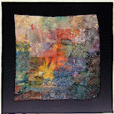
JULY/AUGUST CHALLENGE
BEVERLY'S PHOTO

Scene in Annecy, France

"Under the Bridge" 13" x 17"
Fabric, tulle, mono filament thread,
oil stick pastels, inkjet printing
It's the reflections in the water
as well as the bridge that captured my attention ... the reflection of
the one large building in particular.

I
had masked that off from the rest of the photo so I could play with
Photoshops filters on the top portion of the picture. When I hit on the
above combination, I got excited about mixing the realistic reflection
in the water with an impression of the actual scene. Woo Hoo! I get to
use my "ortwork" collage technique.
I printed two copies of the reflection on "InkJetPrinting" fabric by Jacquard.

This
was because I needed more than one width of the 11" across of that
prepared fabric. I rotary cut each of them into sections and then gave
those serpentine edges. Then they were combined to portray the building
and fill out the dimension to the 13" that all of my IT pieces measure.

Those
bits cut away from the serpentine edges became reflections in the water
... along with a lot of threads, bits of roving, and "stuff".

I let that one building fill the width at the top of the piece.

And then I fell in love with the bridge.

I
hadn't intended to make it so solid and realistic ... that happened
with the quilting. So it has become the focal point. Of course, it's
commanding the prime visual spot of just above the center in the
composition which ensures attention.
Even though my life has been hectically full for the last two months, this challenge piece had been in my mind often. It was physically begun and finished in one day.
IT Member Submissions:

........................................
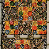
SEPTEMBER CHALLENGE
Debra's Photo

Indonesia

"Nelliephant" - 23"x 17"
fabric, tulle, yarn
oil stick pastels, watercolor pencils, ink

To turn an ordinary elephant into a "Nelliephant":

.............................................................
OCTOBER CHALLENGE
JUDITH'S PHOTO
 Saratoga Springs, New York

Saratoga Spring Fountain


I had literally "hit a
fence" for most of the month in trying to decide how to interpret
Debra's photo. My usual playing around with the picture in the
Element's filters had not provoked any ideas. Expressing my frustration
in a conversation with my husband got me going.
He said, "How about playing with the lyrics to that song 'Don't Fence Me In'".
I said, "I've already made a quilt with that."
He said, "How about putting an animal behind the fence?"
I said with a BIG smile, "Yeah! A 'Nelliephant"
I
knew there was just the right sized elephant in a printed fabric
somewhere in my stash. Finding it got all my fabrics resorted and
refreshed in my mind as to what I have stored here at the cottage.
All
of my IT pieces are the same size, 23"x 17". However, the size of the
elephant wasn't large enough to scale the whole picture for this one
that big. I cut a piece of batting about 12"x 9" and started layering
the background in my "ortwork" collage technique.

I
was so absorbed in creating this piece that I neglected to take anymore
process photos than the one above. That's black tulle making the
shadows in the foreground and a bit of blue wool roving for the sky.
To turn an ordinary elephant into a "Nelliephant":
- Strips of various black fabric scraps were cut for the hair.
- The glasses were drawn on the paper side of a fusible web, then ironed onto black fabric and cut out.
- The eye glasses were ironed into place. The dots of color were made with watercolor pencils over the tulle netting after the quilting was done. The tip of the pencil was dipped into water and gently rotated in place to leave just a dot.
- Face color was added with oil stick pastels. The pigment was rubbed into the fabric through the tulle with a stiff stencil brush.
- An eyebrow and lashes were drawn in with ink.
- The glasses strap is yarn laying loose on the surface.
- The earring is a jump ring with a metal charm ... a key to unlock that gate?

I
played with varying the the layers of batting, as well the sequence of
quilting the different areas to get a bass-relief effect.
- Two additional layers of batting were placed behind the elephant's head and the corrugated metal parts of the fence. I machine stitched around those shapes and then trimmed away the excess batting on the back.
- One additional layer was added behind the slatted part of the fence. The slats were quilted and the excess batting beyond it was cut away. The fence and foreground was quilted first before it was placed on the large beige linen background piece.
- Then the small picture piece was trimmed to size and the edges finished with couched yarns.
- It was centered on the large beige linen fabric that also had a layer of batting and backing. The sky and and trees were quilted through all the layers so that part would be compressed into the background.
- The elephant's head and ear was again stitched around again through all the layers.
- The corrugated fence parts were quilted through all the layers. In reality it appears closer than the gate.
Decorative yarns were couched
to surface of the linen on each side through the batting and backing
before the picture part was added to it.
At
the end I outlined the slats of the gate with ink. Using a heavy black
thread to quilt them may have done the job. However, I didn't see that
they needed emphasis until the piece was finished.
This piece ended up being fun to make. It sure does elicit smiles and giggles from everyone who's seen it.
IT Member's Submissions:

IT Member's Submissions:
OCTOBER CHALLENGE
JUDITH'S PHOTO
 Saratoga Springs, New York
The fountain itself is about the only thing that appealed to me when I looked at Judith's photo mounted on my design board this month ... so I cropped in close to feature it.

Saratoga Spring Fountain
13"x 17"
fabric, wool roving, yarns,
tulle netting, oil stick pastels
But
first, a background was needed. I chose to feature the brick foundation
under the fountain. I found a photo in Flickr of bricks laid out in a
herringbone pattern. I printed it out on paper and assigned a number
to each brick, then cut them apart to use as patterns. The grout part
is a whole piece of cloth torn slightly larger to extend beyond the
outside bricks.

The
bricks were held in place on the grout fabric with a temporary spray
adhesive. For the background surrounding the pavers, I chose a batik
that reflected colors and elements of the surrounding courtyard. A
piece of violet colored tulle netting was laid over the background and
then quilted.

I
played with the fountain by cutting out shapes on brown craft paper and
coloring in with pastels. The fountain part was good, but the basin
was too small.

I
redrew the basin and used the paper pieces as patterns for cutting the
fabric. I can't believe a photo wasn't taken before details and texture
were added with wool roving. Here it is (before the quilting) next to a
photo of the fountain.

A
layer of yellow-orange tulle trapped all the pieces of fabric, roving,
and variety of yarns and thread to create the running water. The
excess tulle beyond the edge of the fountain was trimmed away after the
machine quilting was done.
Final details and shading to define edges and highlights on the fountain were added with oil stick pastels.

I'm
not satisfied with how the front edge of the fountain looks with the
quilting. That part may get reworked sometime in the future IF this
piece is ever displayed anywhere other than my studio.
IT Member's Submissions:
............................................................
NOVEMBER CHALLENGE
Kim's Photo

This month Kim has provided us with a photo of a cottage in Sissinghurst, Encland. After much study of the photo and a lot of pondering, I found it was the patina of the aged wood that very much appealed to me.

Narrowing my focus to feature just the door let me get "into" composing a piece to meet the challenge... let me enjoy the journey of interpretation.

"Door of Yore" - 13" x 17"
fabric, tulle, oil stick pastels,
water color pencils, pastels,
and yarns
To get layers and depth of texture
and color for my door I began with a piece of marbleized fabric. A
silver metallic oil stick pastel used to make a rubbing over a course
wood grain made a good start.

My
next decision was to select a suitable fabric for the grout between the
bricks. Surprisingly, the back side of a metallic printed fabric in my
stash had the gradations that would work. Pieces were cut and laid in
place directly on top of the batting.

The
prepared door fabric was cut and placed in the opening along with the
timber frame. Then bricks were cut from the same marbled fabric the
door is cut from. That, too, surprised (and delighted) me in how
wonderfully well it played its roll to portray those old bricks seen in
the photo. The bricks were held in place with a temporary spray
adhesive.

A
triangular shaped piece of dark purple tulle laid over the top left
corner of the door created a base shadow. I then overlaid another layer
of a lighter lavender tulle over the whole piece.
Then
the quilting began. First, I free-motion quilted around all the
bricks. Then a variegated yarn that had a strand of metallic thread was
couched to define the boards within the door and it's frame. I used a
thin irregular black cotton yarn along the top and bottom of the door
frame.
Water
color pencils were used to add more texture as well as deep shadows to
the door. More shading was done with oil stick pastels. Water color
pencils were also used to deepened the orange color in the section of
bricks next to the door. That stronger color balanced the block of
green on the opposite side.
The
greenery was created by cutting up many different green pieces from my
scrap bags. Each section was composed and quilted separately. Each has
a different color of green tulle overlay, as well as different greens
for the "crumbs" to help differentiate the plants. Different quilting
patterns also helps to define each kind of plant. The potted plant in
the photo below is ready to be quilted. The excess tulle will be
trimmed away afterward.

There's
a bit of oil stick pastel work to punch up highlights and shadows in
the various plants, as well. Note the terracotta pot in the above photo
is cut from that same marbleized fabric used for the door and bricks.
To
create a focal point as well as to personalize the composition, I
referenced my own front door for the placement of the stone face...

... and used a photo of one of the stone faces that hangs on our patio wall.
It
was a struggle for me to get started with this one. The photo features
an idyllic setting that is almost too perfect and too pretty.
Narrowing my focus to feature just the door let me get "into it" ... let
me enjoy the journey of interpretation.
IT Member's Submissions"


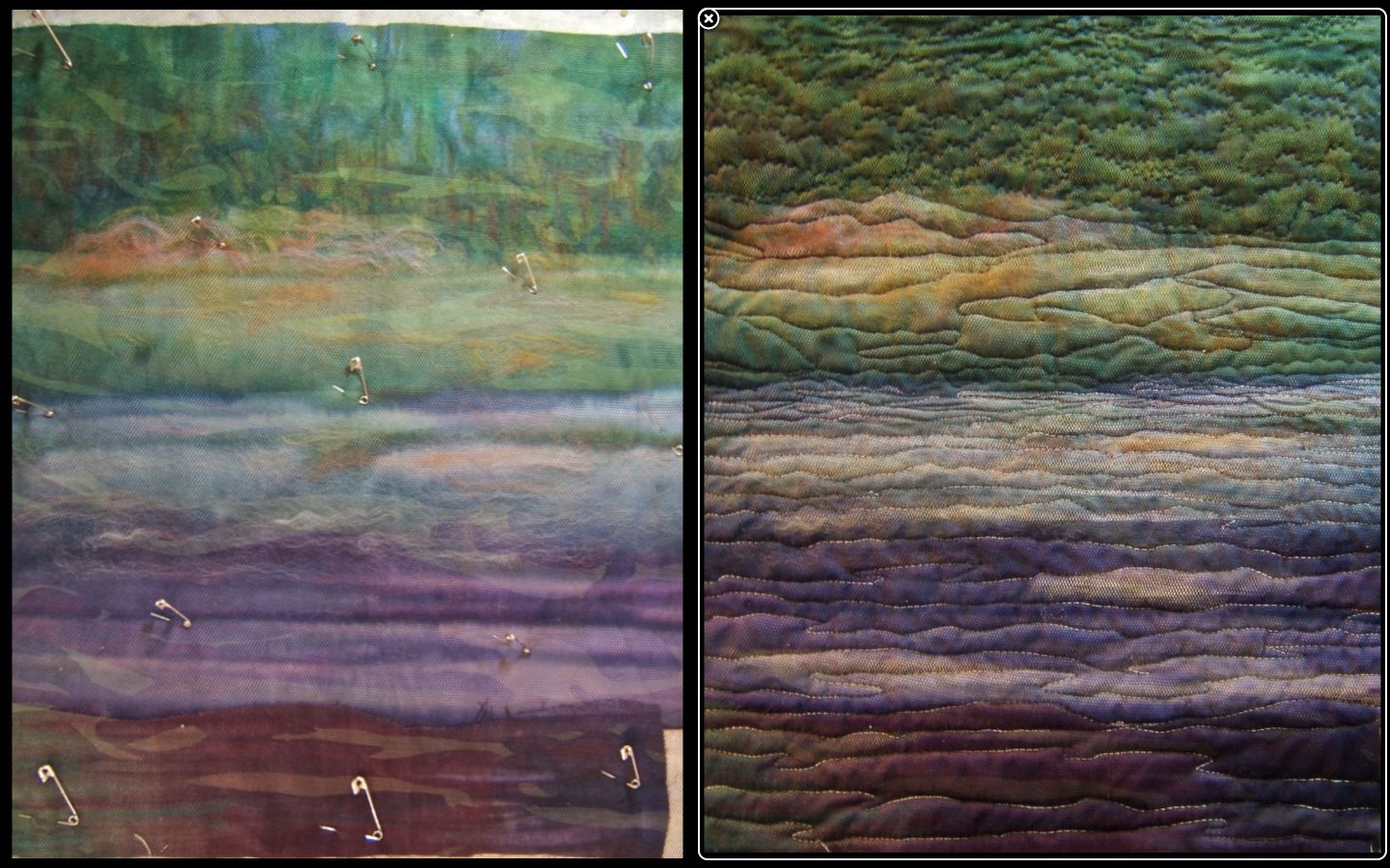
 Moon River - 13"x 17"


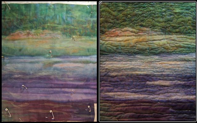

 I
wish you could see this piece in person. There's a softness to this
dark piece that doesn't come across in the photos. The few who have
seen this in person react with an intake of breath and say, "It's
moonlight!"
I
wish you could see this piece in person. There's a softness to this
dark piece that doesn't come across in the photos. The few who have
seen this in person react with an intake of breath and say, "It's
moonlight!"
IT Member's Submissions:


The piece that I had the most fun with is this one.

I will miss being a part of the monthly reveals. Finally letting everyone see what had to be kept under wraps for the month was as exciting as getting to see my fellow participant's results. I loved that!
IT Member's Submissions"
...................................
DECEMBER CHALLENGE
Barbara's Photo


fabric, netting, yarn,
oil stick pastels, paints,
machine stitching
There
were a couple of events that led me to the idea of interpreting
Barbara's photo of weeds along the Mullet River in Plymouth, Wisconsin
under moonlight. One was the winter solstice in mid-December and the
other was this piece that was the result of "just playing" (read about
it here) earlier that same month.

Moonlit - 11"x 16"
To
get started I played with the picture in Photoshop Elements. I flipped
the photo to change the direction of the angled lines and position of
the blossoms. I prefer the focal point to be in the upper right
quadrant of a composition. Also, I like to guide the viewing path from
right to left within a picture. These changes help to keep the viewer's
eye circling within the composition rather than allowing them to sweep
out that lower right corner. Also, the "hue/saturation" was adjusted in
PE to see more the effects of low light conditions.

Then
I went online looking for photos of "moonlit scenes". Here are three
of the many, many pictures that I scrolled through to help me decide how
to present this landscape on a moonlit night.

I
very much liked my bright and fanciful "Moonlit" landscape. I chose
background fabrics that have pure, but watered down hues (left). Bits
of wool roving were applied to add softened light as well as to soften
shapes (right).

Instead
of my usual choice of tulle to trap the roving, I chose this netting
with a camouflage design printed on it. My thought was that it would
add random shadows and spots of light to the composition.

It's
pinned onto the piece in the picture on the left and you can see the
camouflage patterns scattering pools of shadows and light across the
piece.
As
you can see in the picture on the right, the machine quilting diluted
those effects. They're still there, but much more subtle than I had
anticipated.
On
this IT piece I decided to stick closer to realism than the fantasy
exhibited in "Moonlit". So I got out my oil stick pastels to darken
many shadowy areas as well as to highlight a few areas reflecting the
moonlight. At one point, I was dismayed at having lost/buried the
wonderful colors and patterns that I had at the beginning. However, I
was on a quest to achieve night time effect so I kept going. Silk
flowers and leaves were cut to shape and arranged over the background
(left). A yellow-orange tulle holds all of them in place. It was cut
away from the background areas after the machine quilting around the
plants was done (right).

And
then more ... much more ... work was done with the pastels and paints
to get the effect of seeing colors and shapes on a moonlit night. All
along the way through this creative adventure photos were taken.
Converting them to black and white let me see whether I maintained a
contrast as well as a balance of lights and darks.

IT Member's Submissions:
...........................................................
FINAL THOUGHTS
The piece that best exemplifies all
of my creations for this year long challenge to interpret a chosen
photograph is this one of a scene in Annecy, France submitted by
Beverly.
"Under the Bridge" 13" x 17"
Fabric, tulle, mono filament thread,
oil stick pastels, ink-jet printing
The
physical elements that comprise this interpreted picture are a
combination of my signature "ortwork" technique with an ink-jet printed
portion of the actual photo. The piece is readily recognizable as my
style as well as the particular place presented by the photo. It
represents my perceived intent of these challenges for the group. The
line of thinking for my approach to these challenges is akin to how
musicians interpret, or translate, a musical score ... a successful
interpretation being one that's recognizable as the composition written
by the composer.
I
very much enjoyed the monthly adventures in exploring possible view
points and techniques to meet the challenge. One direction that was new
to me, and that I took often, was using the computer as a design tool.
Previously, it had only been used to check out the values of a
composition by converting a photo to black and white.
 Otherwise,
it was used to edit and store photos of my work. I learned to utilize
the Photoshop Elements program. In particular, experimenting with the
image in all the various "filters" to get a different view ... to gain a
mental distance from the actual image. And, too, printing those
results or portions of the photo onto fabric is another aspect of the
computer I had never done before. In the piece pictured at the top of
this post two copies of the building's reflection in the water were
printed on fabric. They were cut apart into serpentine shapes and
recombined to fill in the width of the piece. The butterfly in this
piece is cut out from an image I found online and had printed onto
fabric ...
Otherwise,
it was used to edit and store photos of my work. I learned to utilize
the Photoshop Elements program. In particular, experimenting with the
image in all the various "filters" to get a different view ... to gain a
mental distance from the actual image. And, too, printing those
results or portions of the photo onto fabric is another aspect of the
computer I had never done before. In the piece pictured at the top of
this post two copies of the building's reflection in the water were
printed on fabric. They were cut apart into serpentine shapes and
recombined to fill in the width of the piece. The butterfly in this
piece is cut out from an image I found online and had printed onto
fabric ...

Using the computer is now added to my "tool box" of skills and will be readily considered in making future work.
Using the computer is now added to my "tool box" of skills and will be readily considered in making future work.
You
may have noted that all my pieces are the same size, 13" x 17". The
first one, my self-portrait, just happened to end up those dimensions.
That size fit the place mat setting for the plate of Chinese food of the
first photo challenge, so I used it again. After that, I designed each
piece to fit this format either in a vertical or horizontal
orientation. A consideration for an exhibition of all these pieces was
part of my thinking, too.
The piece that I had the most fun with is this one.
"Nelliephant"
Before
taking part in this challenge I had never considered working from a
photograph. Now I realize that it's possible to incorporate my view and
techniques to make a unique piece that still relates to its source.
This success, plus enjoyment of the challenge, makes me consider the
prospect of doing commission work ... something to which I had
previously said, "NEVER".
I will miss being a part of the monthly reveals. Finally letting everyone see what had to be kept under wraps for the month was as exciting as getting to see my fellow participant's results. I loved that!


 Fabric Bird Sculpture Pattern