Reflections II
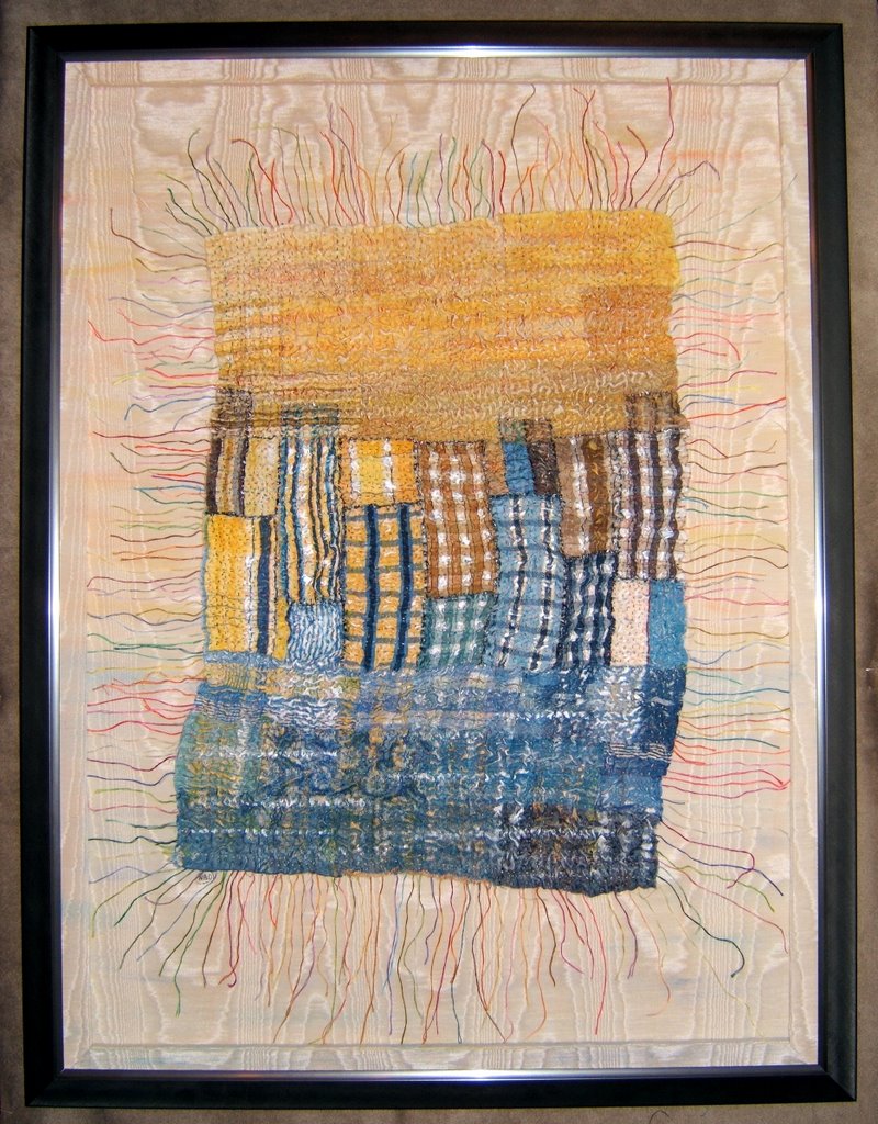 "Reflections II" - 20"x28" - 2006
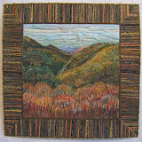
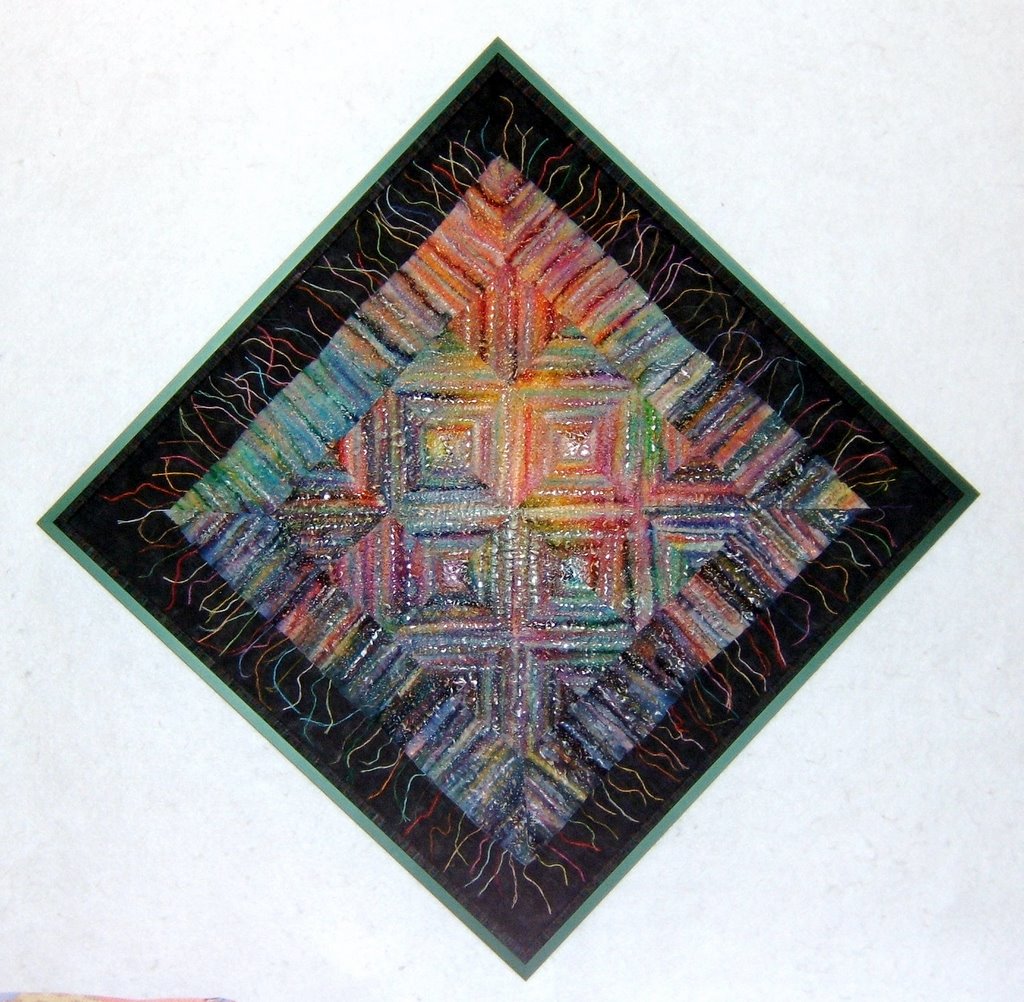
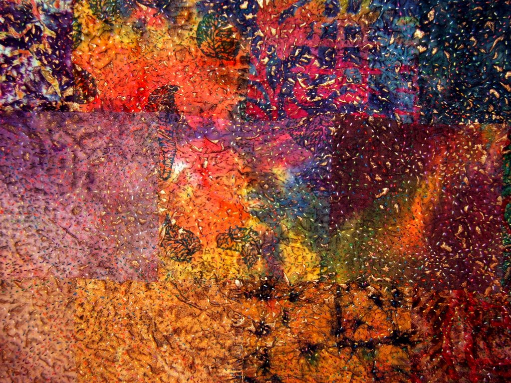
This piece began as an exercise, a personal challenge, to get across the color wheel from blue to yellow. A young decorator friend had given me books of fabric samples. The pieces from one in particular had a lot of blues and yellows with wonderful textures and plaids that I couldn't resist playing with.
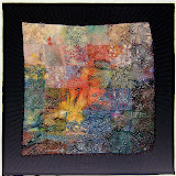
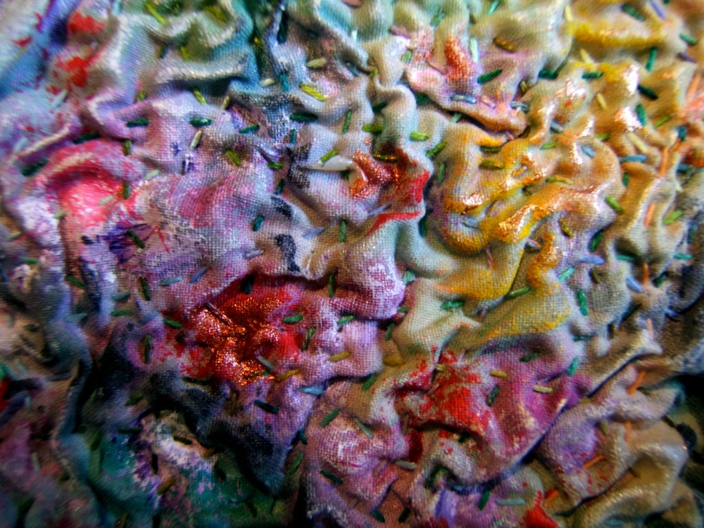
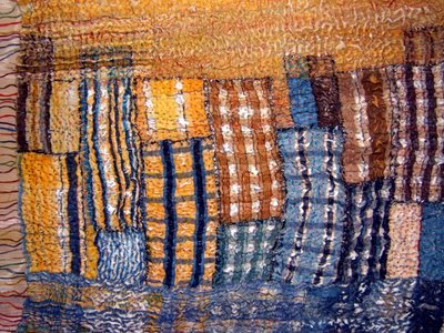 I cut all the pieces the same rectangular size and played with their arrangements on my design board. Some of the pieces were cut in half to make a better composition and to help me obtain my goal. The plaids were a great transition between those two complementary colors. The orientation was horizontal in this process. It wasn't until the I was quilting that the piece began to reveal itself to be a city skyline reflected in a river with a smoggy sunset sky. You can see the added paint and pastels that emphasize the buildings and their reflections. I also used oil stick pastels to blend the upper pieces in the sky. Pastels were also used to extend lines of color into the backgound mat of moire fabric. The raised outside border is covered with the excess fabric trimmed from the four sides, so it too has the extension of pastel color lines.
 I cut all the pieces the same rectangular size and played with their arrangements on my design board. Some of the pieces were cut in half to make a better composition and to help me obtain my goal. The plaids were a great transition between those two complementary colors. The orientation was horizontal in this process. It wasn't until the I was quilting that the piece began to reveal itself to be a city skyline reflected in a river with a smoggy sunset sky. You can see the added paint and pastels that emphasize the buildings and their reflections. I also used oil stick pastels to blend the upper pieces in the sky. Pastels were also used to extend lines of color into the backgound mat of moire fabric. The raised outside border is covered with the excess fabric trimmed from the four sides, so it too has the extension of pastel color lines.
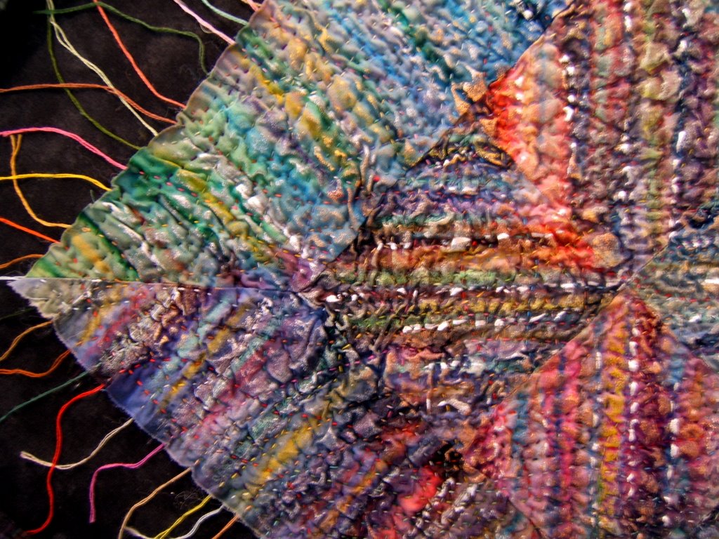
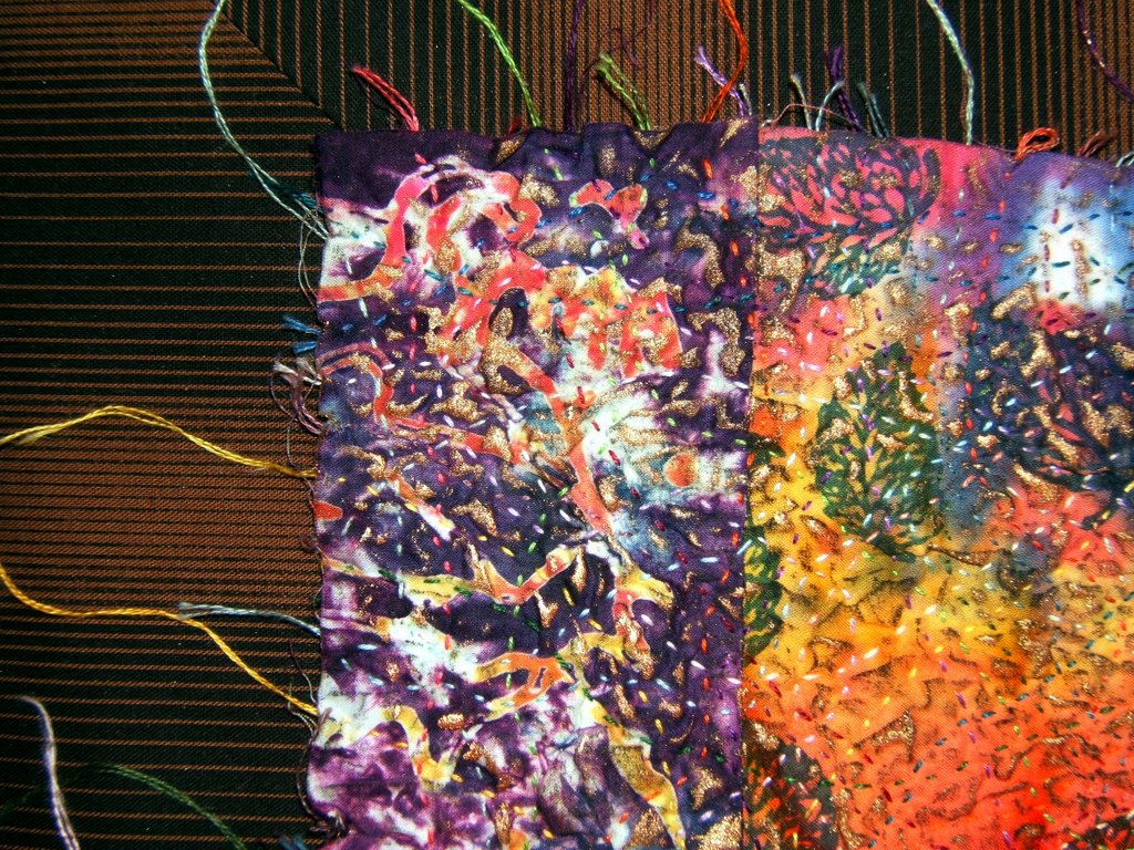
 The extended strands of floss (2-ply strands) that are the beginning and ending of each line of stitchings get one tiny dot of glue under it to hold it in place. This aura of colored threads is just as much a part of the composition as any other element and I want control of where they lie. Without it, those thread ends are a tangled mess. In the photo below they've been separated, but not yet adhered.
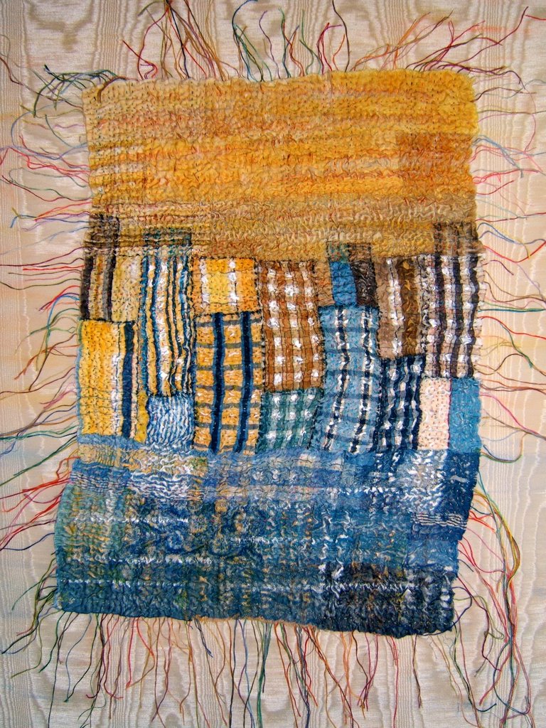 "Reflections II" is exhibited and for sale at MB Gallery in Chicago, Illinois.
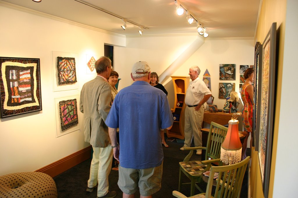
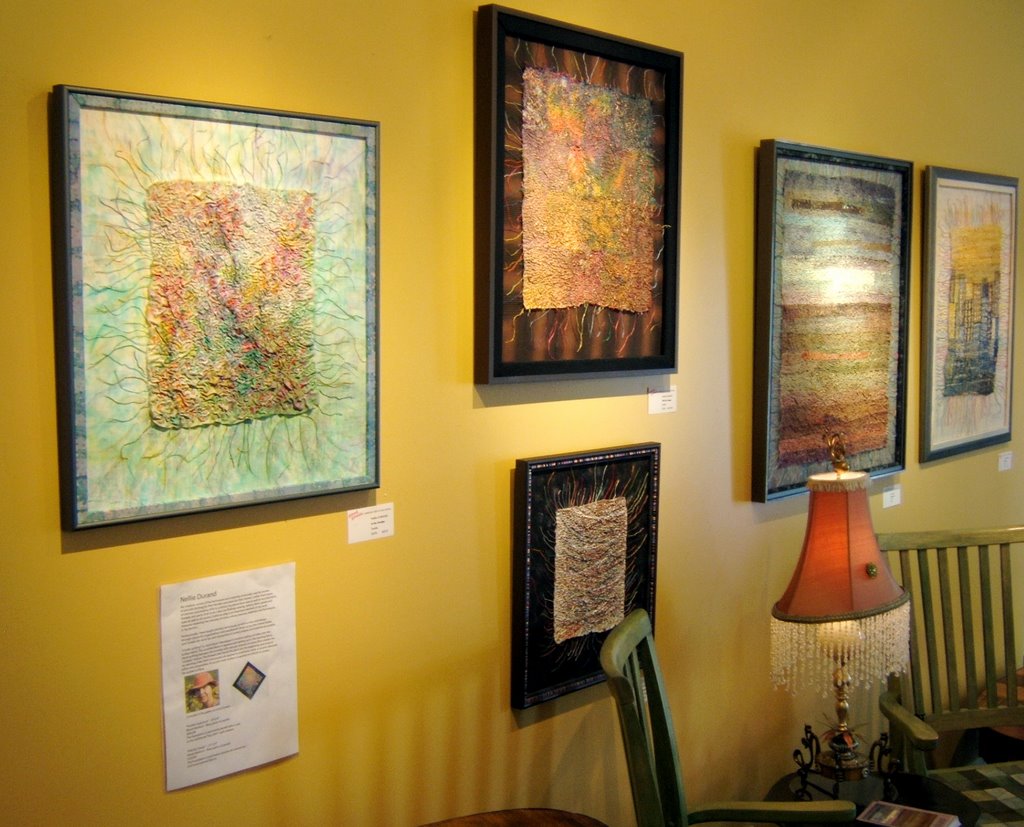
All photos are clickable for you to view a larger version in a separate window. Click the back arrow icon of your server to get back to this post. The highlighted text is also clickable to take you to the link or posting that is being referenced.
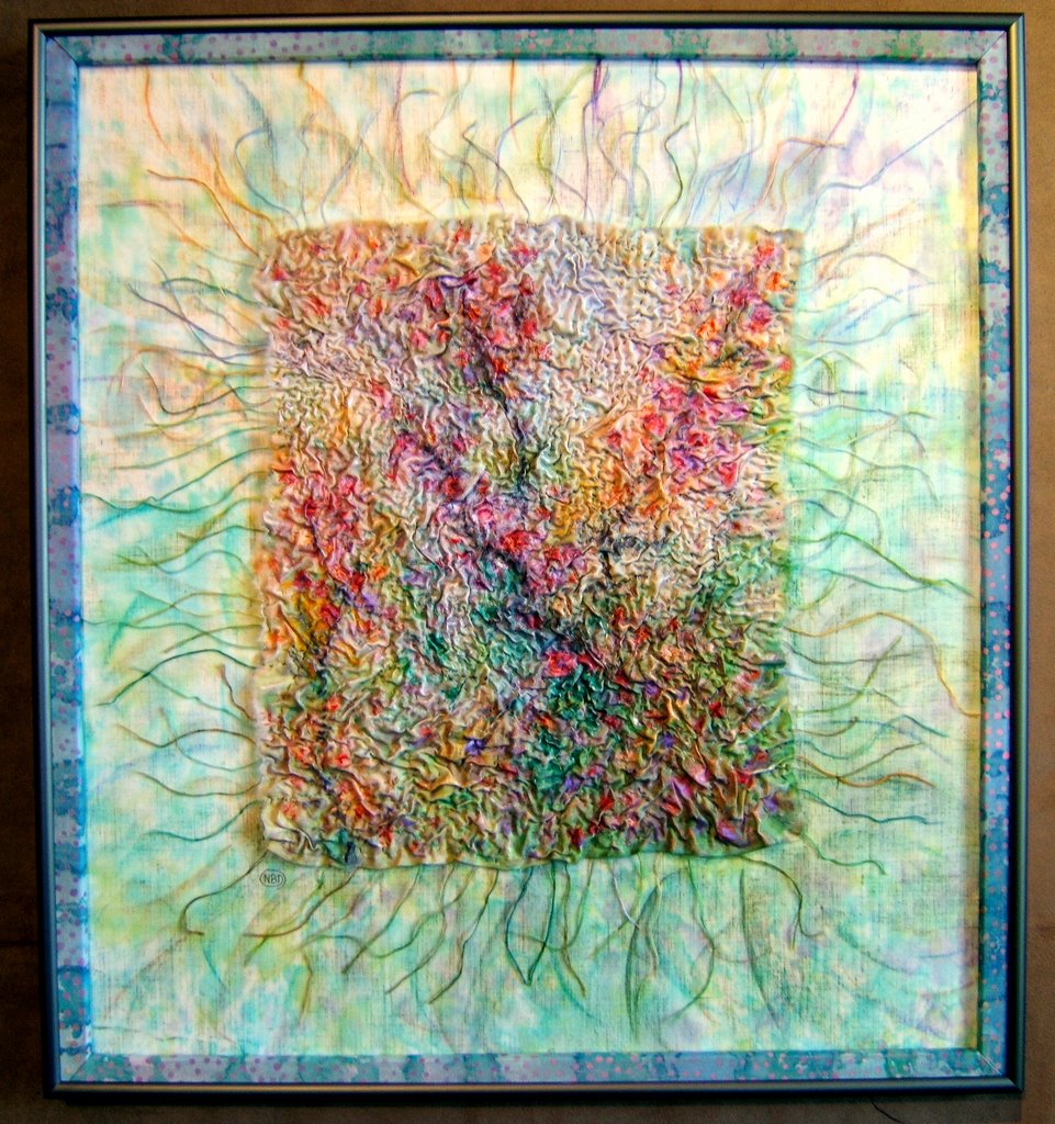
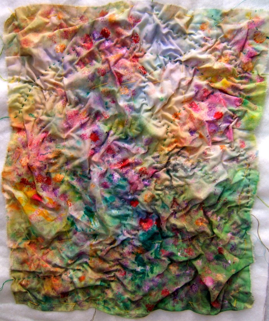


 Fabric Bird Sculpture Pattern