
Division of Space
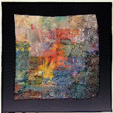
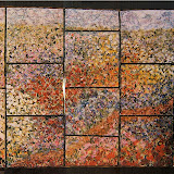
This quilt is divided into three sections. It "happened" that way because there were two blocks that were so different from the all the others. They were embellished with beads and had metallic and silk fabrics. I made two flanking blocks by cutting the one diagonally and adding the black discharged linen fabric to complete them. They dictated that they belonged together and had a story to tell ... and were to be the focus of this quilt. The other blocks would just have to find their places above or below them. To figure out a dimension for additional parts in a quilt I use a measurement that is already there. I've concentrated on sewing the center panel of this spiral quilt together so I would know exactly how wide the quilt would be with the piecing I had planned. That section is 48" wide and 18" high. The common denominator in this dimension is 3 ... each of those numbers can be divided by 3. Then I got out my graph paper to figure out my vertical divisions of space. I can more easily count out and see what's going on by drawing quilt dimensions on squares. In this drawing one square equals 3".
 The top section was laid out on my design board with the premise that it would be deeper than the center one. All the while I had in mind that the bottom one would be the deepest of all. So thinking in terms of 3, I added 3" to the 18" depth of the center section to come up with 21" deep for the top one. Guess what the depth of the top section on my design wall measured? It was 21 inches! Hmmmmm.... a strong clue that I was definitely on the right track since my intuitive sense of proportions had already figured out that dimension.
To make that bottom section the widest, but in proportion with the other two I added 6" (2 x 3) to the center panel's 18" to come up with a 24" depth. All three depth dimensions added up to 63". The proportion of 48" wide to 63" high looks and "feels" right to me. I drew out those proportions and dimensions on tracing paper and played with it a bit just to make sure.  The left side is a tracing of what I had drawn on the graph paper. On the right side I centered the middle section making the top and bottoms ones equal in depth. They're deeper than the middle one which gives a touch of variety. This arrangement is definitely balanced ... too balanced for my taste ... a bit boring and predictable even though it has more interest than if all three sections were the same size. I still liked the layout on the left best. The largest section at the bottom anchors all the busy energy in this quilt.
It is unusual for the center of attention to occupy the smallest area. What makes it appropriate for this composition is that it is made up of the three largest blocks. Plus they gain even more importance by being set off with a definite frame. It also has a different feel or character from the top and bottom sections.
The next time you see a picture of this quilt there will be no open spaces. I'm still fiddling with that area in the upper left corner and I have a good idea how to fill the lower right.


 Fabric Bird Sculpture Pattern


5 comments:
This is really taking shape! I like the way the orange carries the eye around the quilt. Another thing that makes the center section the center of interest is that light block, don't you think?
As for the graph paper, and the divisible by three facts, aren't you glad you learned math in the good old days? I have been working on a circular project, and I have thanked my HS geometry teacher many times.
I am learning so much following your thought processes on this quilt! It's looking wonderful.
I'm practically copying what Joyce just said. I've saved a number of your posts to study. This one is particularly interesting -- I dislike the drawing/planning and graph paper part, but after all, THAT is what lead to a successful project.
Thank you.
I don't know how you do it, but you seem to always address an "pending" issue I am trying to cope with! I can be lazy about drawing things out but I can see that this approach will result in a more pleasing layout.
BTW, I love the layout you chose!
This post is so important and interesting that I have copy on my block-notes.
ciao ciao
Post a Comment