
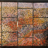
Am I Done?
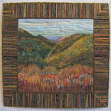
All four border pieces are quilted, the yarn is couched over the seams, and several choices of fabric for a 3/4" binding is being auditioned. I also filled in color with oil stick pastels to extend flowers across seams in the border. It's looking good. However, I'm having the problem of deciding what more, or if any more, is needed in this piece.
32"x 30"
I chose the strong pattern of water color flowers with the same coloration in a wide border to balance and compliment the center. But does it? The quilting patterns help to unify the two parts. Is it wishful thinking on my part that it's finished? Am I too attached, too much in love, with that center piece the way it is? I like the branch with its implied extension across the width of the quilt as well as the angled sweep of flowers on the vertical. Does it need something more? The center piece is about air and atmosphere. That aspect is reinforced by the variegated yellow and green yarn that is slightly fuzzy plus the flowers floating on the light valued background in the borders. But does it work to have "distance", a big hole, as the focal point? Am I done?


 Fabric Bird Sculpture Pattern


17 comments:
Mmm, a very interesting question. What would happen if that branch became real, rather than implied? Anything else that could be done in that center area to provide a more discreet focal point? I don't have an answer, but think they would be interesting questions to play with.
I really can't give you an answer, but wanted to say how much I'm liking this piece, whether it be done or not. So pretty and spring-like!
As usual, you're brave to throw this out there for comments!
I can see this with the branch and maybe an outline of a similar flower extending into the center.
Beautiful colors in this piece, and the quilting is lovely too.
I would "encroach" a wee bit into the centre with a few spare branches and buds---just my opinion
I wouldn't touch it! It has a very cottagey, shabby chic, laid back feel. As I first thought this was a pillow, my suggestion is to make a complimentart pillow and one of your birds to match. That maybe more sweetness than you want but I it would work in the cottage style decor.
I don't think I would do anymore either Nellie.
I have been sitting here looking at it for ages and I can't imagine anything else that you could do that would make it look any nicer than it already does.
My first thought was Oh, that's lovely. My second thought was that the border was a little too wide for a border, i.e something to frame the centre. If you leave it that wide you need to incorporate it INTO the piece rather than just using it to frame the piece, in which case it needs something more in the foreground. mmm, don't know if i've explained that very well...
Very beautiful, the delicate colors and your quilting and the combination of the inner and outer part. Also the outer part brings movement. How about making the binding a little bit less dark, greyish or even greenish?
I myself would hesitate to make them blend together anymore. They already blend to a point that they almost seem the same piece. I would probably work against that as I usually do and do something to take the focus back to the center.
That's always the question with art in any medium. I like it the way it is, but some branches and flowers extending into the middle might work too. I like the idea of a matching bird.
As I am looking at the piece, I now see that the larger border is sort of a "blown up" version of the interior-an effect I didn't think of before. I do think it serves to balance out the more finite scale of the interior piece. The addition of that thin inner border sets the middle apart as its own entity but also serves to unify the two sections.
I don't know that I see a "big hole" I do see distance because of the different scales of the flowers and the "impression" of flowers in the center peice as compared to the real flowers in the border. I do think that the middle section has enough of the darker colors at either corner to balance out the brighter yellow portion. My eyes do travel around in a circle still even with the different orientation.
If I can say so, I think any more would be gilding the lily. I can't wait to see the binding too. Hope the comments aren't too much:)
Libby
Oh, it is lovely and precious and perfect.
I would just add some sparkle in it ... either in the form of metallic thread, or shiny little beads (or small sequins) all over.
I think you are done - it's just beautiful the way it is. The colours are glorious and all that lovely quilted texture makes me want to reach out and feel it. I wish I had your talent.
The fact that you are asking seems to indicate that you don't think it is finished. someone mentioned beads or some texture to the center. that might help the eye to linger there.
Personally I think this is just beautiful as it is. I like the impressionist color as light effect of the center framed by the detailed flowers in focus. the couched thread that has a bit of an asymetrical spin brings the eye around the whole work. Very successfully I would say.
Well you know I have 3D flowers on the brain these days...so some white ones somewhere in the center...not too big, just off the surface in a subtle way.
These colors are sooo luscious.
Nellie it's finished!!
Leave well enough alone..VBG
I Love it, and I Love Monet too..
Thanks for sharing
xoxo
((((hugs))))
Maggie
Post a Comment