Nellie"s Needles

Friday, February 27, 2009

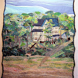
"Imagine Monet" Is Finally Finished

I thought it was finished ... and most of you considered it done, too. But then I began to wonder if I could soften the transition between the dark binding and the body. I tried a variety of yarns and this gray-green chenille is perfect.
It not only is a value transition, but a the fuzzy texture serves to soften the hard line.

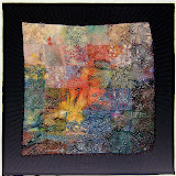
"Imagine Monet" 30"x 32"
Here's a peek at the back side. As you may recall the center panel and the four border pieces are constructed and quilted separately. They are connected with a wide zig-zag stitched seam. To cover up the stitching and to strengthen that join, I place a tube of fabric over it and hand-stitch it in place on both edges.
All photos are clickable for a larger picture.

Monday, February 23, 2009

I'm Done

"Imagine Monet" is finished ... I think.
Imagine Monet - 30" x32"
The binding and hanging sleeve are sewn in place. A bit of work with oil stick pastels has been added. There is definitely a tree standing on the right side. The trunk at the bottom was filled in by shading with black and gray pastels.
The pink and orange to the right of the couched yarn is added pastel work as well. I also strengthened and lengthened branches at the top. You can also see the added blue and violet pastels along with a bit of branch drawn in the top corner of that right border where it had been just background. To strengthen the illusion of a tree, I lightly drew dark broken lines in the center panel.
I thought I'd share the sample used for trying out ideas and different quilting threads and pattern as well as for getting the tensions adjusted on my machine for the stitching. It's a sandwich made with the same materials. You can see that at one point I considered coloring some of the leaves in my quilt pattern. They looked good, but I opted to keep the spaces open.
I use oil stick pastels to accent and shade many art quilts. They are heat set which also melts them into the fibers. But to have a heavier coverage of pigment requires more of the pastel on the surface. It concerned me that the colors may rub off onto other surfaces ... specifically hands and other quilts.

I did a research online for information of how artists set them on the even less porous surface of paper. The brand of fixative that tested as the best to "fix" pastels to paper was Krylon. Other brands of spray fixatives didn't set the pastels as well ... they more easily flaked off the surface. A number of fiber artists use Workable Krylon. I've discovered a Krylon spray that is UV-Resistant and is non-yellowing. To quote the product information:
It is a clear acrylic coating that provides a permanent, protective coating which protects art, crafts, and valuables against harmful UV light rays. Use to protect photography, watercolor, fabric, display materials, pencil, charcoal, florals, and more. Moisture-resistant and smudge proof.

There are strong cautions about spraying this product without using a face mask. One of those layered paper ones works well. It's also a good idea to spray outdoors.

Sunday, February 22, 2009

"Getting There"

Wow! I'm surprised and pleased at the attention this quilt has gotten. A big "thank you" to all who have responded with comments and suggestions for the dilemma of "am I done?".

I very much liked this piece as it came together, but there was the pestering question about how the center was "being read" ... how it related to the bold flowers. The more I looked at it, the less I was enamoured ... the more that question niggled around in my head.

Whenever this happens , I know I'm not done ... that the piece requires something more, but what? Often, possible solutions rise to the surface of my mind during sleep. When that happens I can hardly wait to get to the studio to try my new idea.

This morning I woke up with a clue as to what is bothering me about this piece. Very possibly it's the orientation. In my mind, while creating the center piece the red and yellow areas were flowers while the blue and white was distance and sky which made even the thought of rotating the piece not even a consideration. Although, I had turned it upside down at one point to confirm which way was up, a vertical orientation instead of the horizontal landscape one never entered my mind. So anyway, I hurried to my studio to rotate it one turn.
Amazingly, how the center piece "reads" changed tremendously. It no longer has the feeling of deep distance, or "a hole" as I referred to it previously. It has come forward to work better with the up close border flowers. Now the yellow has become tall shrub flowers in the sunshine and the white just a nebulous corner. I'm also seeing that previously horizontal fragmented limb as an upright tree ... mmmmmmmm.

30"x 32"
I had made what was the bottom border wider. That makes for another dilemma ... can that wider border remain on the left side? In the first set of photos a strip of the binding fabric is pinned where it would be cut to make it even with the other three. I'm looking at it on my design board without the binding ... and it's growing on me. I think it can stay wider than the other three sides.

Oh, and it now has a title "Imagine Monet".

Am I Done?

All four border pieces are quilted, the yarn is couched over the seams, and several choices of fabric for a 3/4" binding is being auditioned. I also filled in color with oil stick pastels to extend flowers across seams in the border. It's looking good. However, I'm having the problem of deciding what more, or if any more, is needed in this piece.

32"x 30"
I chose the strong pattern of water color flowers with the same coloration in a wide border to balance and compliment the center. But does it? The quilting patterns help to unify the two parts. Is it wishful thinking on my part that it's finished? Am I too attached, too much in love, with that center piece the way it is? I like the branch with its implied extension across the width of the quilt as well as the angled sweep of flowers on the vertical. Does it need something more? The center piece is about air and atmosphere. That aspect is reinforced by the variegated yellow and green yarn that is slightly fuzzy plus the flowers floating on the light valued background in the borders. But does it work to have "distance", a big hole, as the focal point? Am I done?

Saturday, February 21, 2009

Newest Piece

It's time ... past time in fact ... that I get my quilt entries going for this year's Smoky Mountain Quilt Guild show. This is one of two hanging on my design wall.
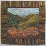
The center panel was done in 2002. It is one of three studies I made trying to get the effect of what the impressionist painters achieved ... specifically Monet. I blogged about those studies here. This was the last and most successful one ... and my favorite.
For years I thought that it could stand alone and if I'd just give it a finished edge it would be DONE. Several weeks ago I dug it out and pinned it to my design board to remind me to do just that. However something was niggling around in my head urging me to try to expand on this smallish piece (20"x 17"). I remembered that a number of years ago a friend had given me the leftovers from custom-made drapes which featured beautifully "painted" flowers. It took a half day of sorting through my stash to locate, but it was worth it. It co-ordinates with and expands that piece beautifully.

Because the center piece is already quilted, the four floral borders are each machine-quilted separately. The hanging piece of yarn is being auditioned as the one to be couched over the seams that join the borders to this "ortwork" center piece.

Thursday, February 19, 2009

Today's Title is "Stitched Up"

A blog to which I contribute every week is "Today's Title is ..." This week's subject is "Stitched Up".
Here's a photo of my contribution. Click on the title of that blog to read more. For additional information on my art piece from which this detail is taken go here.

If you'd like to see even more there's an album featuring all of my crinkle quilt art pieces in the sidebar.

Saturday, February 14, 2009

More Feathered Birds

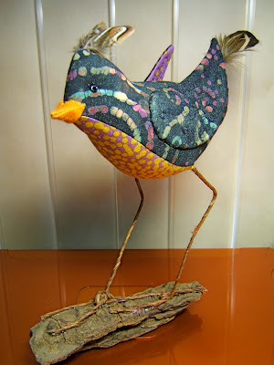
You've seen this bird previously here. He's gained a headdress and a tail feather. I could not resist using this one duck feather with the same stripe pattern as those on the birds head.

Then I discovered some pheasant feathers that had the same color and pattern as his tail feather.
Then I found these yellow pheasant feathers that reflected the burst pattern on this birds back. Serindipity at work?Here's another view to show off the rest of his body.I take my cue from mother nature and consider the birds with bold showy patterns to be male, while those with quiet subtle ones to be female.

Happy Valentine's Day

Your visits to share in the adventures of creating my art are very much appreciated and I am ...

Friday, February 13, 2009

One World, One Heart Gifts

The luck of the draw for gifts from other participants in this huge gift giving event happened three times for my name. I had visited all 911 blog sites, but had left comments only on the ones that offered a gift that I would really want to receive.

This beautiful gourd bowl gifted by Barbara Valianti of Reading the Sky is decorated with fillimiore canes. I will love having her work added to the collection of art in my studio that represents the creative energy of my fellow artists.
A lovely handcrafted copper freeform heart pendant with Swarovski crystals, fresh water pearls, and some vintage crystals wrapped in square copper wire is the gift from mrs beadsley of maine. This, too, along with its creative energy will be added to the art in my studio.
A" Journal and Embellishments assortment" was one of three gifts given by Gerry Hookstra of Sewing Southpaw. These goodies will find their way into some of my creations.
Participating in this world-wide gift giving was an adventure. I send out a big "thank you" for the generosity of all who shared their work and all those who came to visit me ... especially to those who have added my blog to their reading lists. Thank you! Thank you! Thank you!

Thursday, February 12, 2009

One World, One Heart Gift Drawing Announced

Photo
At 12:00 noon EST the drawing from 287 comments left by those who desired this gift was made.

I'm amazed at the number of people from around the world who visited my blog and by how many stuck around to check out other postings. Even more amazing is that 23 added themselves as "Followers" of my blog. I thank all who visited me for their interest and participation in this world-wide gifting. Thank you, Lisa Swifka of A Whimsical Bohemian for including me on your caravan of 911 gift giving bloggers. If there was a link to a blog in the comment, I visited in return and discovered blogs that I now visit regularly ... blogs that I would never have known about without this event.

I enlisted help from my husband by asking him to choose three numbers ... three times:
  • first set from 0-2
  • second set from 0-9
  • third set from 0-9
... and the WINNING NUMBER is comment 143
belonging to Pat Winter

For those of you who really, really, really wanted to win this bird here are two options for you:
  • Make one. My pattern and instructions are posted as PDF files online. Just click on the red lettered words to download them to your computer to print out.
  • Buy one. They are sold at two galleries for $60 plus postage:
Good Goods Gallery
106 Mason Street
Saugatuck, Michigan 49453

Morris Galleries
111 N. Main
Sweetwater, Tennessee 37874

Wednesday, February 11, 2009

Never Mind

If you are accessing my blog through Google Reader, you have seen an incomplete post announcing the winner for the bird in the One World, One Heart gift drawing. For some reason Google Reader published this from the draft that I've been writing. I needed a head start so it could be published at noon when I will away from home and my computer. So, if you've read that unfinished post and wondered "what the heck?" ... never mind.

Has anyone else had this problem of a draft being published by Google Reader?

Monday, February 09, 2009

Making "Snow Globe" Valentines

Every year I make valentines for my grandchildren that include photos of me and each of them. This year's pictures are cut from a photo taken of us making faces when I was with in Chicago at Christmas time.
They are old enough for me to finally make a "snow globe" type of card with lots of tiny stuff. The message written inside is "All Shook Up" in reference to tiny stuff shaking around ... and the presence of Elvis.
I printed four copies of the photo to get that many pictures of me, which made four pictures of each grandchild ... they're all used in his/her valentine. The pictures are glued to a heart shape that is cut from red card stock.

The message is written with a big fat silver Sharpie pen.

A fat chenille yarn was glued around the outside edge of the red heart. Then the fun began! Sprinkling sequined hearts, stars, circles, plus some featuring Elvis and granules of glitter. Too much glitter was put in the first valentine I constructed ... it obscures the background and photos. I also put about 8 beads in the mix to serve as spacers between the two layers of hearts.

A heart shape the same size as the card stock one was cut from firm clear plastic that I had saved from packaging of other "stuff". A line of glue was applied around the outside edge. It was positioned over the red heart with the glue side down on top of the chenille yarn "bumper".

After the glue had dried , I machine couched that same fat chenille around the outside edge to secure all the edges. Use a very wide zig-zag stitch that is not spaced too close together to avoid making a perforated line of holes that easily tears.

All that's left to do is write a special message to each child on the back of the valentines with that same silver Sharpie, put them into envelopes and get them into the mail.

PS: To see last years cards that I made for these kids, go here.

Now, to make valentines for some of my friends made from copies of this photo.
It's a crazy quilted heart valentine that I had given to my husband in 2001.

Sunday, February 08, 2009

Two More Birds Join the Flock

Another black bird is added to the flock. I'm so glad to have discovered those Luminatre H2o paints.
I applied one coat of "Scarab Beetle", which has luminescent flecks of all the colors in a dark base. On the previous black birds I painted layers and streaks of various colors ... "Black Cherry", "Bougainvillea", "Blue Grass", and "Ocean Wave". Each method gives different, but equally good effects. I recommend the one coat of "S B" on a print fabric and streaks of multiple colors on plain black.

This bird flew in on breath of spring-like air. He reminds me of an Easter egg. He required no added paint.
My fabric birds inspired my friend, Judy, to draw some fanciful birds in her sketchbook. She even named each one.
PS: To see a beautiful sunny day on an icy Lake Michigan go here. That site features a new photo every 30 seconds, 24 hours a day taken by a camera that is hooked up to the web. There's a permanent link to this site in my sidebar for your viewing pleasure any time. At night you'll only see the lights at the ends of the piers ... that is unless there's a ship entering or leaving the channel.

Tuesday, February 03, 2009

Artful Undergarments

I'm tickled!!! and just have to share a couple of links about making artful things out of bras. The first one is for a good cause.

The Girls Measure Up by Jackie Price
"Members of Quilters of South Carolina have created one-of-a-kind bras for Breast Cancer Awareness. The exhibit consists of forty-nine original works of art which are unique, entertaining, humorous, and beautiful to make the public aware of breast cancer, to memorialize those lost to the disease, and to honor survivors. " Go here to see all those artful bras (2 pages) and read exhibition information.

The second is a hoot ... along the lines of making those slippers from a personal hygiene product.
Bra Bag by Carol Taylor in Wales
My friends who were gifted those slippers just may get pretty bags next year. Go here to see more photos and read about Carol's making the bag pictured above. Go here to see those slippers and get instructions for making them.

Monday, February 02, 2009

The Flock Is Growing

Here's another attempt at a Red Winged Blackbird. The Luminare paints give an amazing iridescent effect to black or plain fabrics.
I had used this fabric for the colored part of the wings. Now I'm wishing that I had done less coloring with the red paints and pens. Plus, it ended up more orange than desired. I may have to try again.
After working with the plain fabrics, I needed to make a couple of brightly colored birds. Luminare H20 paints sparkle up this funky bird.
This bird sports a tail feather ... a find that was blowing across the sidewalk when I left quilting bee last Thursday. There's no paint added to the fabric of this one.
The photo of this pretty bird arrived in an email from Great Britain this morning.
Carol, its maker, says, "My bird had a date at the hairdressers today, so I could take her photo ( ribbons added ) Ignore the legs, it was all I had at the time, courtesy of my grandson's craft box and I still haven't been to the flower shop for wire. When I do get the correct wire, she'll have new legs and some friends." To see more of Carol's work go here.