
Back To Unraveled
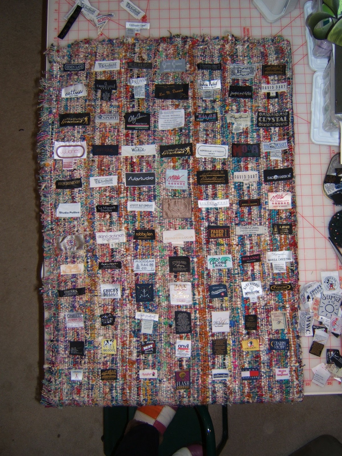
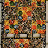
More than a week ago I had couched the black-and-variegated color-twisted yarn to the piece with the clothing labels.

Whew! What a massive mass/mess of yarn!

Cutting the ends of the tied knots at the corners of the labels in the top rows cleared out a lot of the tangled bulk.

This twisted wool yarn is lighter in weight than the sari silk yarn used in my last unraveled piece. Consequently, the falls made with the wool hang more full and fluffy which covered up the labels in the bottom rows. I experimented with stringing beads on some of the strands to weight them, but decided that touch was "too much", so they were cut off.

The fluffy falls weren't my only problem. I don't know how I overlooked the fact that the continual vertical spaces between the labels were more important than the horizontal ones. Those are the channels where the falls hang ... DUH!
I ended up cutting many of the wool strands rather short to eliminate the bulk as well as to showcase the labels. Working with this deconstructive process is tricky. It's one snip at a time with lots of studying between cuts.

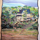
14"x 24"
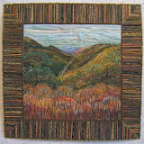
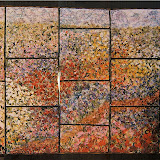
I can live with that much "peek-a-boo", but I'm not crazy about this unraveled piece. It may not get finished. I am still excited by this concept and have laid out labels on this piece of raw silk for my next one.
24" x 36"
The placement of the labels is a bit rough in this initial layout, but note how the vertical spaces between the rows get wider in the bottom half. Also, I'll be couching silk and silky textured yarns on this one.


 Fabric Bird Sculpture Pattern


7 comments:
Why is it important to see the labels?
LOVED the first piece from first time I saw it! What strikes me on the pieces: 1ST: shouts in color, rectangles great colors, uniform in size, base and yarns also lots of color, yarns hang well. 2ND piece: labels interesting but lack the vibrant color and not uniform in size, wider and seems to add to bulk and doesn't draw my eyes directly to and down it, my eyes dart from one label to another, not as cohesive, base and yarns don't add to color and liveliness. Maybe narrower, maybe longer with this, maybe light color over labels, maybe more gathering together similar sizes, maybe strips of fabric added to yarn, less yarn and more graduated in length? With youreye for this, I'm sure you'll figure it out!
It is interesting to note how the black and white yarn makes the colours in the labels show up more. These pieces are looking good Nellie but I prefer the second label piece.
I wonder how it would look to braid some of the yarn?
I like the first piece better because of the color..but then I'm all about color. Can't wait to see what you do with the next one.
I love the concept. I think you are discovering what works and what doesn't. Thanks for sharing the process with us.
always a learning process. I think you made good choices on this one. I'm not particularly partial to the black and white. Looking forward to the 2nd act.
Post a Comment