New Look
You can't help but notice the new look of this blog. I had been trying to get that interesting "comic book" shot of me on my blog. For some reason Blogger wouldn't allow me to change it out. Our younger son who is a Software Architect, as well as my personal "geek squad", is here for this week so I put him to work.
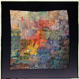
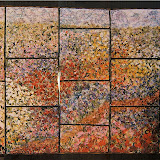
While he was at it, I had him paste in a background of one of my "crinkle" quilts. I got that idea after seeing the puzzle pieces background on Paula's blog. I love hers, but am trying to decide if mine is distracting. Please let me know what you think.


 Fabric Bird Sculpture Pattern


5 comments:
nellie, you are such a sweetheart, always there to pump me up when I need it. thanks for the feedback on my new background and I'm glad it gave you impetus to do the same.
Now for yours....I think a different pic might look a little better, Maybe a dense darker fiber? Its hard to decide, but its great to see something new!
I like your new profile pic! Changing a blog look is like rearranging furniture, takes forever to get it to feel right!
Good luck.
It could be interesting to have a photo of needles....
always good to have a new look..... i like it but i wish the background graphic was a bit clearer.
I like the background
The comic photo....not so much.
While you're tooling around with your template, I suggest you drop your sitemeter to the bottom of the sidebar so that the links to your albums are more prominent.
Cheers!
Hi Nellie - I like the new pic and the background. It isn't too distracting because its only on the sides, not behind the actual text. But I wonder if you are uncertain about it because your title is now a little too small to balance the new background. Maybe if your blog title was heavier in some way, maybe a darker background behind the title or a border for the banner... or perhaps you could just fade the background out a little more.
Nellie, I like the background and the pic.
ciao ciao
Post a Comment